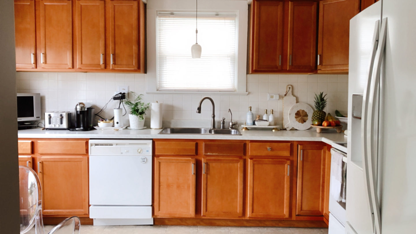
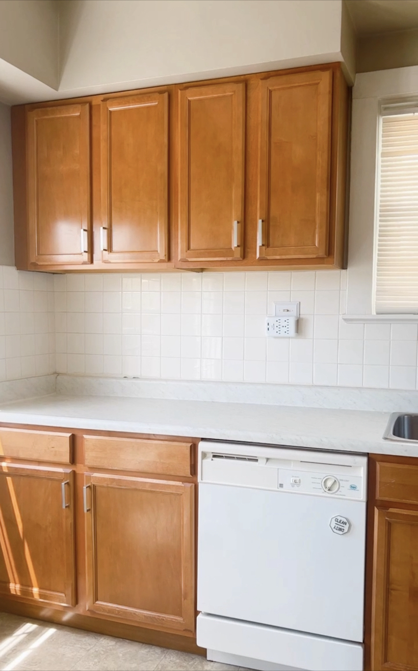
When we first moved into this house fifteen years ago, the kitchen had recently been renovated and it was in great condition. The kitchen had new cabinets and new appliances but it was all builder grade material…oak cabinets, basic white appliances, and peel & vinyl flooring. At the time, we were content with the kitchen and made it work.
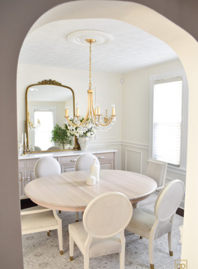
As years passed on, our design choices and styles would change and finally would evolve into what it looks like today – ‘Transitional Modern’ with a sprinkle of glam. It wasn’t until about ten years living in this house did we start investing in making our home everything it could be. We started out by removing the wall-to-wall carpet in the living and dining room and replaced it with engineered hardwood floors. We replaced the terracotta tiles on the fireplace hearth and had marble tiles installed. About four years later we had the backyard deck extended. A year after that, we had custom closets installed in the master bedroom and gave this room a makeover with new carpet and furnishings. This house is 100+ years old and a coat closet was nonexistent. We had to store all of our outwear, winter coats and jackets in a tiny closet, located in the guest room that only had coat hooks. We desperately needed to have a coat closet to house not only our coats but guests coats as well. When it came time to invest in this, I designed the perfect custom coat closets for our living room space where I incorporated a book shelf, a seating bench and ample storage space to store everything from hats, scarves, gloves, to shoes, and more. From there, we redid the tiny closet in the guest room and turned it into a linen closet, completed with custom shelving. Our latest projects we recently had completed was installing this custom dry bar in our living room and refreshing our dining room space with a new paint color, new dining room furniture, new lightening, accessories, and my favorite design elements – chair rail moulding and picture frame wall moulding! Throughout the years, we made small changes like refreshing the master and guest bath, and installing new carpet to the second floor. The interiors of the house finally felt cohesive. As each room in the house was either renovated or refreshed, we could instantly feel how special and functional it is…except for the last room in the house…the kitchen. We had debated on whether or not investing in renovating the kitchen was a good idea since we continue to have talks about moving into a bigger home but we are taking it slow as we want it to be our forever home. After talking with our realtor friend and getting her professional advice, we decided to move ahead with the kitchen renovation. When designing how the new kitchen would look, it was important that this space had the same design esthetic as the rest of the house. Not only that, it had to have ample storage and be as functional as it could be. And so it began…
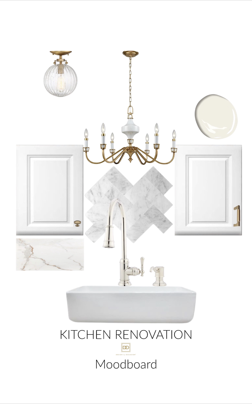
Whenever it comes to designing or refreshing a space in our home, it’s always helpful for me to create a moodboard. This enables me to see how well the pieces selected work together. The first thing I knew before anything was the paint color of the kitchen walls. I wanted to match the wall colors in the living and dining room…Benjamin Moore ‘White Dove’. I decided to tweak the color a bit so I asked to have it mixed to only 70%, which was a shade lighter than the original.
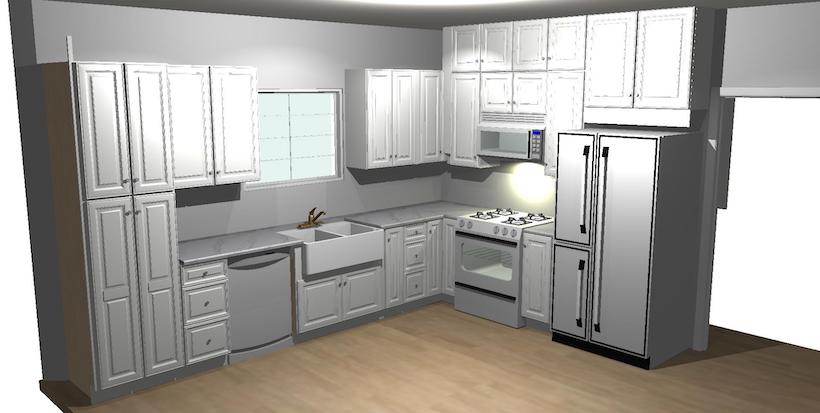
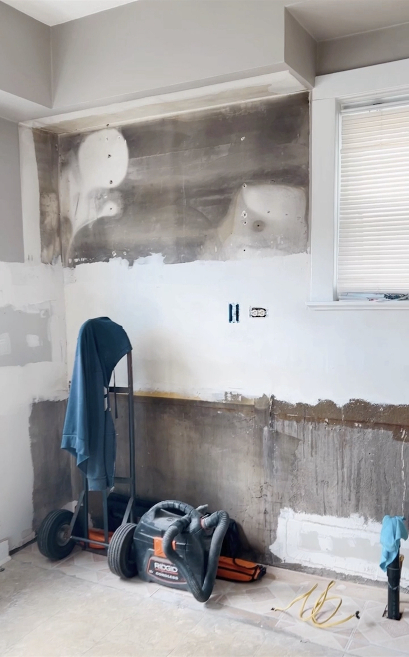
When it came to designing the kitchen, we had about four or five different renderings before we approved the final rendering. It was important that we took our time tweaking the design based on our needs…incorporate as much storage as possible, create function and accessibility with features like draw organizers, roll out trays and a pull out spice rack. To help with figuring all this out, I went through all the kitchen essentials we own, from pots and pans, dinnerware and glassware, to cooking utensils and bakeware essentials. I included the overlooked items like dish towels, coffee pods and tea accessories and kitchen gadgets. I would mark where each item would go on the rendering. This would give me a sense if we had enough storage to house all these items. I found that converting two of the lower base cabinets from doors to drawers was ideal and would keep items more organized. Best decision!
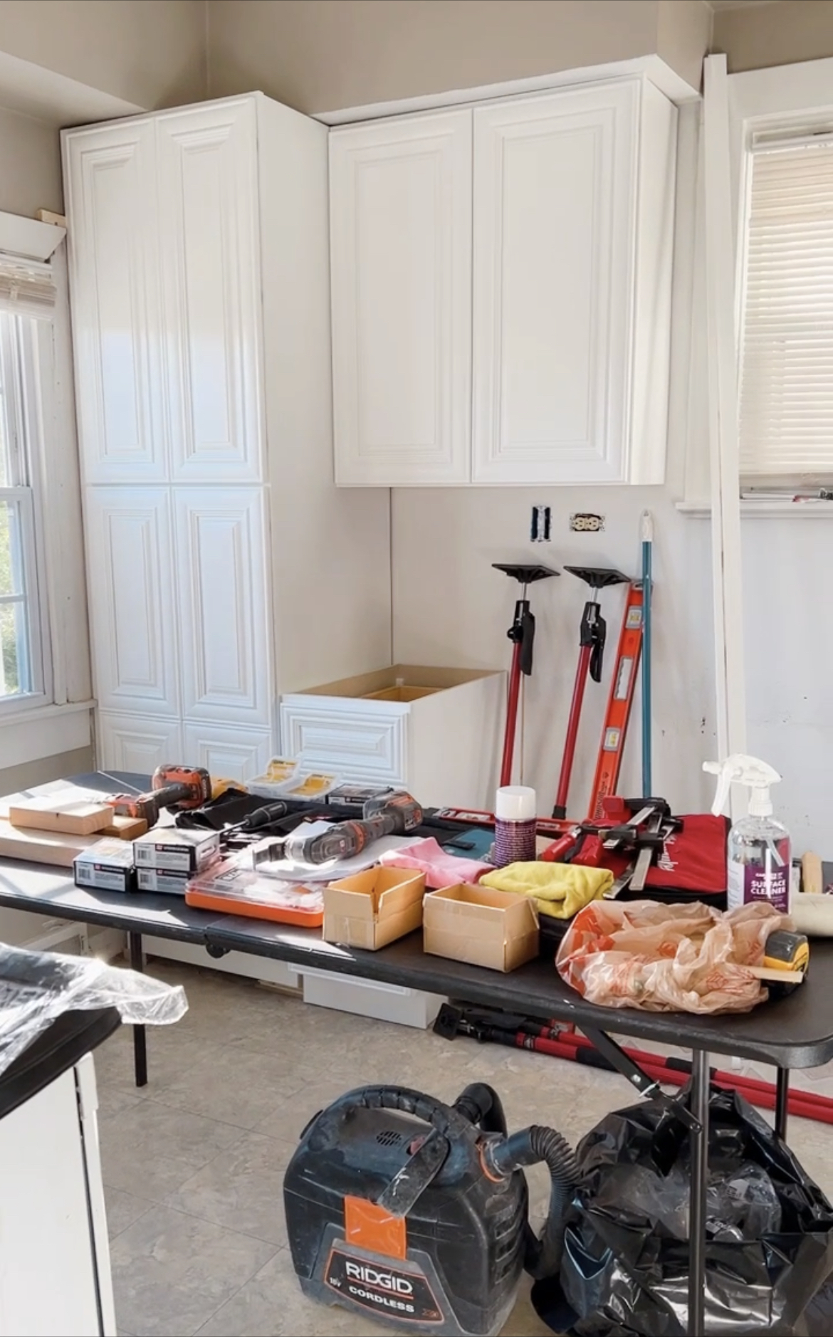
BEFORE
AFTER
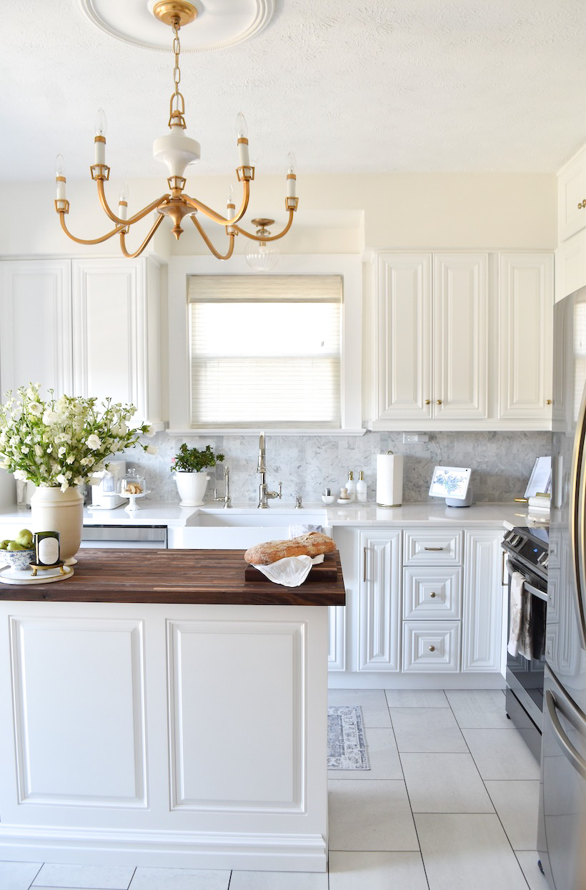
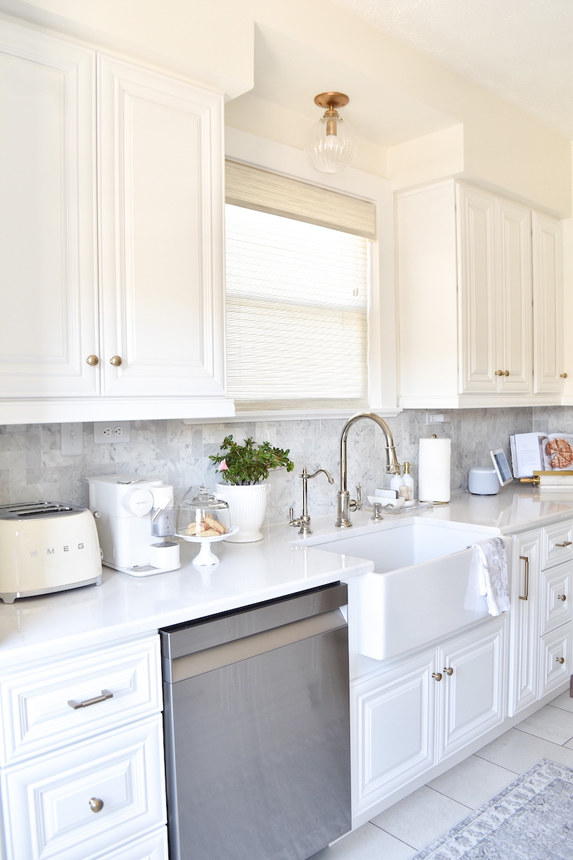
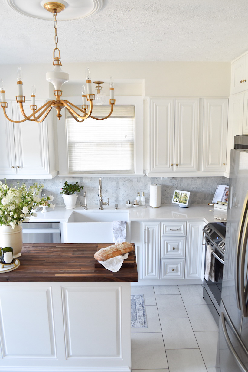
I’ve always wanted an all-white kitchen, so we went with crisp white raised panel cabinets. From what we had before, I can’t tell you how it instantly opens and brightens our kitchen. The doors and drawers are soft close. I adore this feature. For the countertop, we selected a natural Quartz. We wanted a countertop material that was not only pretty but durable, stain & scratch resistant, and required low-maintenance. For an added design feature, we went with a beveled edge. Not only does it soften the edge of the countertop, it’s an elegant design enhancement. The countertop is white with a beautiful gray and slight gold veining. For a muted pop of color, we chose a Sea Salt Stone Tile for the backsplash. The color is a slate gray. The tile design is a modern twist on a classic subway tile. Truth be told, I was confident about this choice until it was installed. After all the finishing touches were added, we felt more comfortable with the choice we made.
BEFORE
AFTER
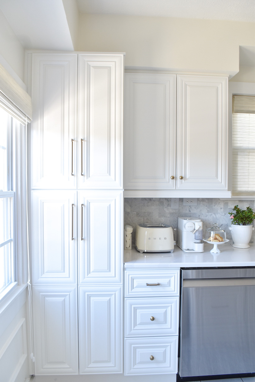
The one thing we knew we wanted more than anything was a pantry cabinet. We were willing to sacrifice countertop space to have a 24×90 pantry installed by the kitchen window! This has been a life saver as before the reno, we had to use a couple of the upper cabinets to house pantry essentials and the top of the fridge had baskets on top to hold snacks and breakfast staples. It was an eyesore – which immediately says – “you don’t have enough room”.
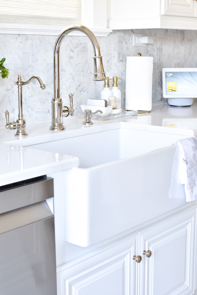
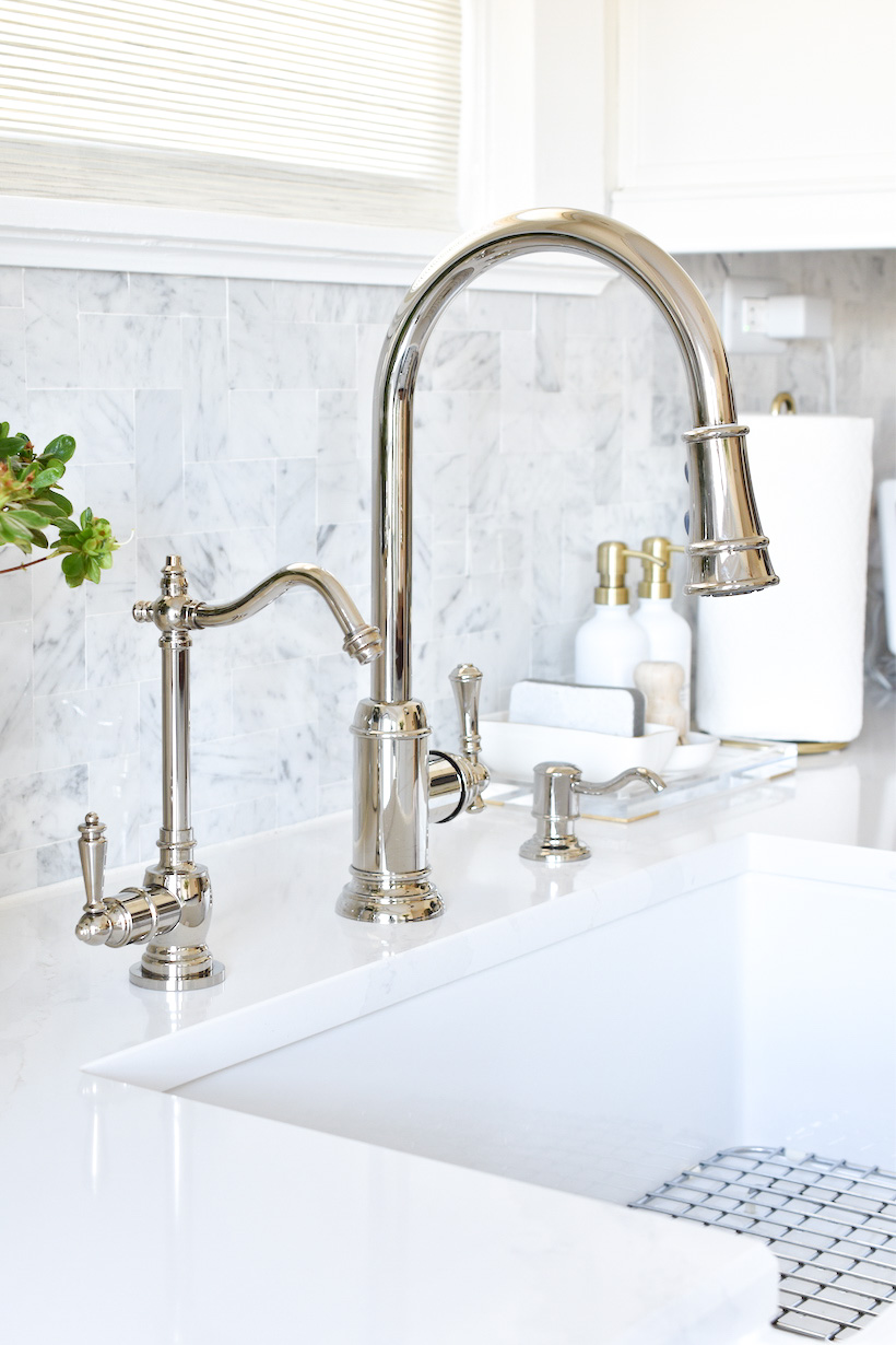
Another feature I knew I wanted in this kitchen renovation was a farm sink. I don’t think I would go back to a stainless steel sink again. I love how it adds a softness to the kitchen. When it came to selecting the finish for the faucet, the soap dispenser, and the water faucet, I was a bit indecisive as apart of me wanted a brass finish. Ultimately, we chose a Polished Nickel (by the advice of my sister) and decided to select lightening and cabinet hardware in a gold/brass finish.
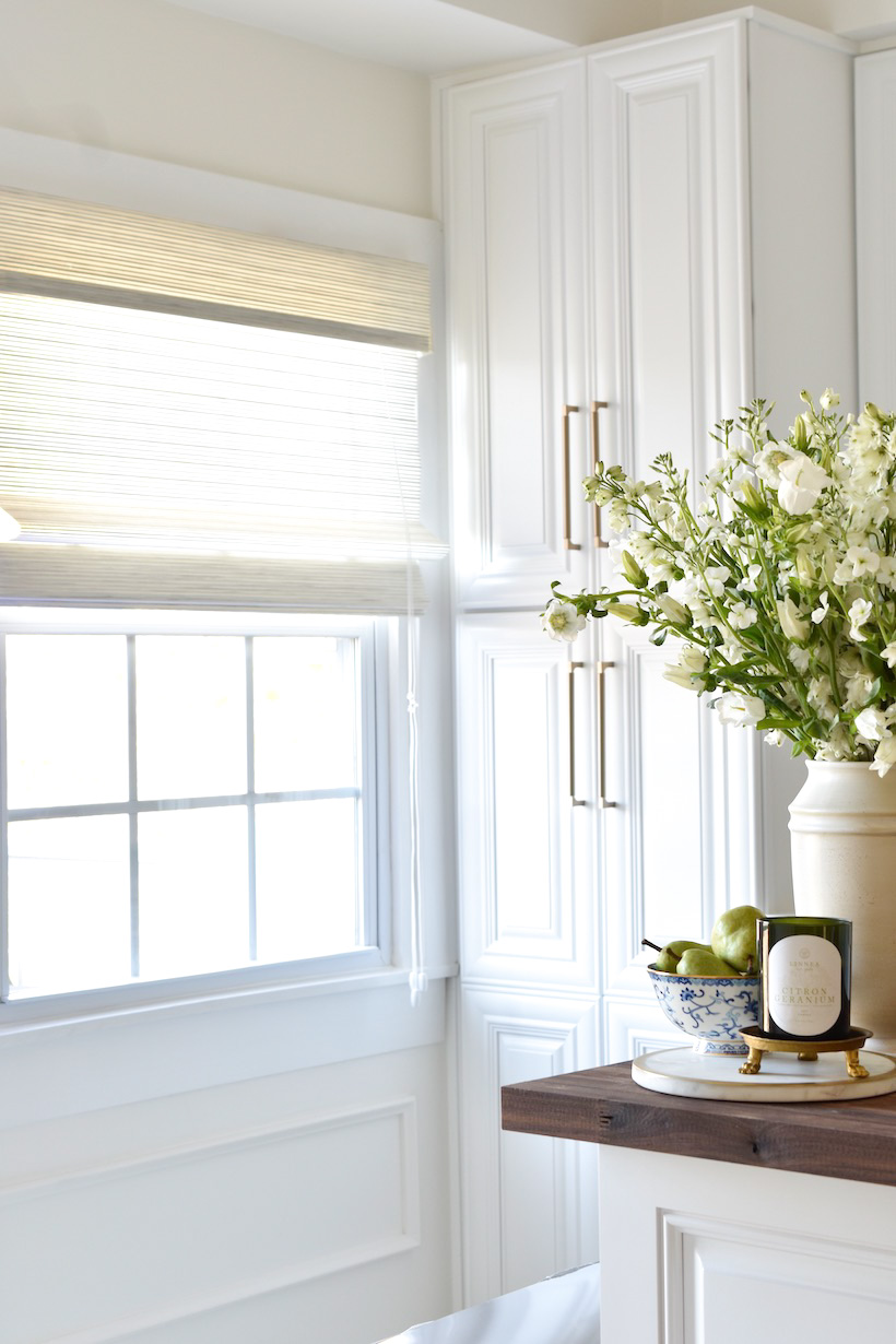
We replaced our previous window treatments with woven wood shades in a beautiful ‘Malibu white-sand color’. The design is a Pinnacle flat style with valances and has a lock/lift cord. We have them for the window adjacent to the deck door and above the kitchen sink. These shades are great as they allow natural light to filter through.
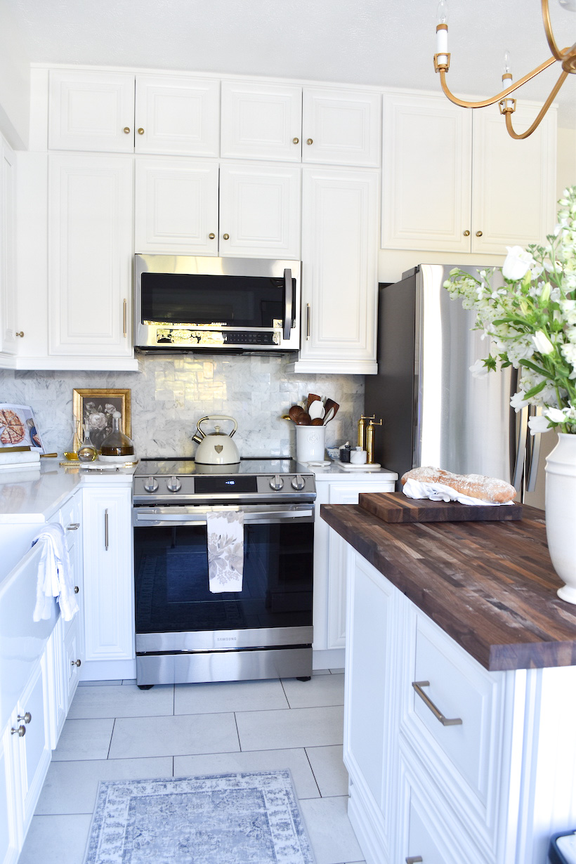
A pet peeve of mine when it comes to kitchen cabinet designs is when the upper cabinets don’t go all the way up to the ceiling. The top of the cabinets wind up being nothing but a dust collector. For this kitchen design, we wanted more storage and that was the solution for above the microwave. We went all the way up! Yes, you need a ladder to get up there but that’s okay. We stored seasonal items that are not used on a regular. It was a challenge for the kitchen designer to make this happen due to the catty-corner but after discussing it with the contractor, they made it work!
Our previous kitchen layout did not have an upper cabinet above the fridge and because we wanted to use every square inch of this kitchen for storage solutions, we had a large upper cabinet installed.
BEFORE
AFTER
BEFORE
AFTER
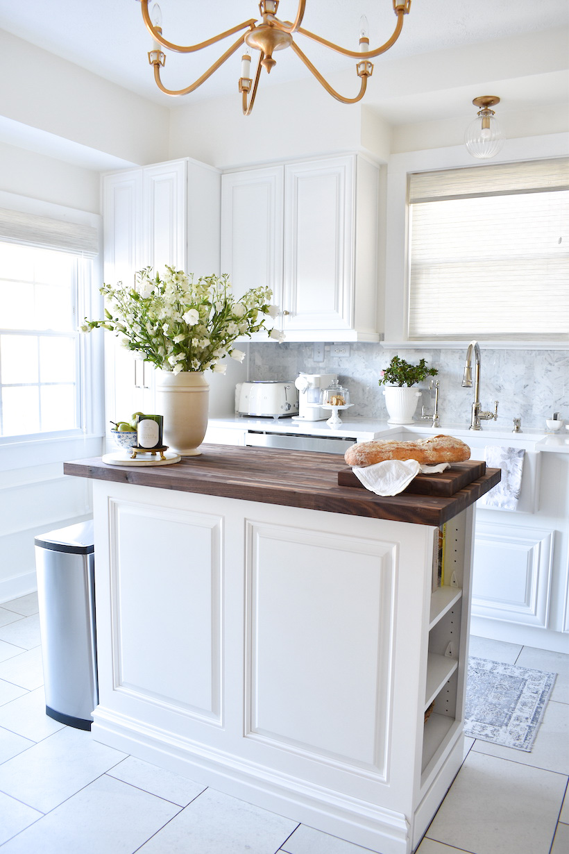
When it came to the two large front-facing kitchen walls, we thought about utilizing the space for custom cabinetry but because of the depth, it wasn’t a possibility and after careful consideration, it would have impacted the space by feeling too overcrowded. One of the renderings had a peninsula connected to the wall where we had previously a small breakfast table and three chairs. We could have had two stools as an alternate seating arrangement but we had preferred to have a prep island instead – installed in the center of the kitchen.
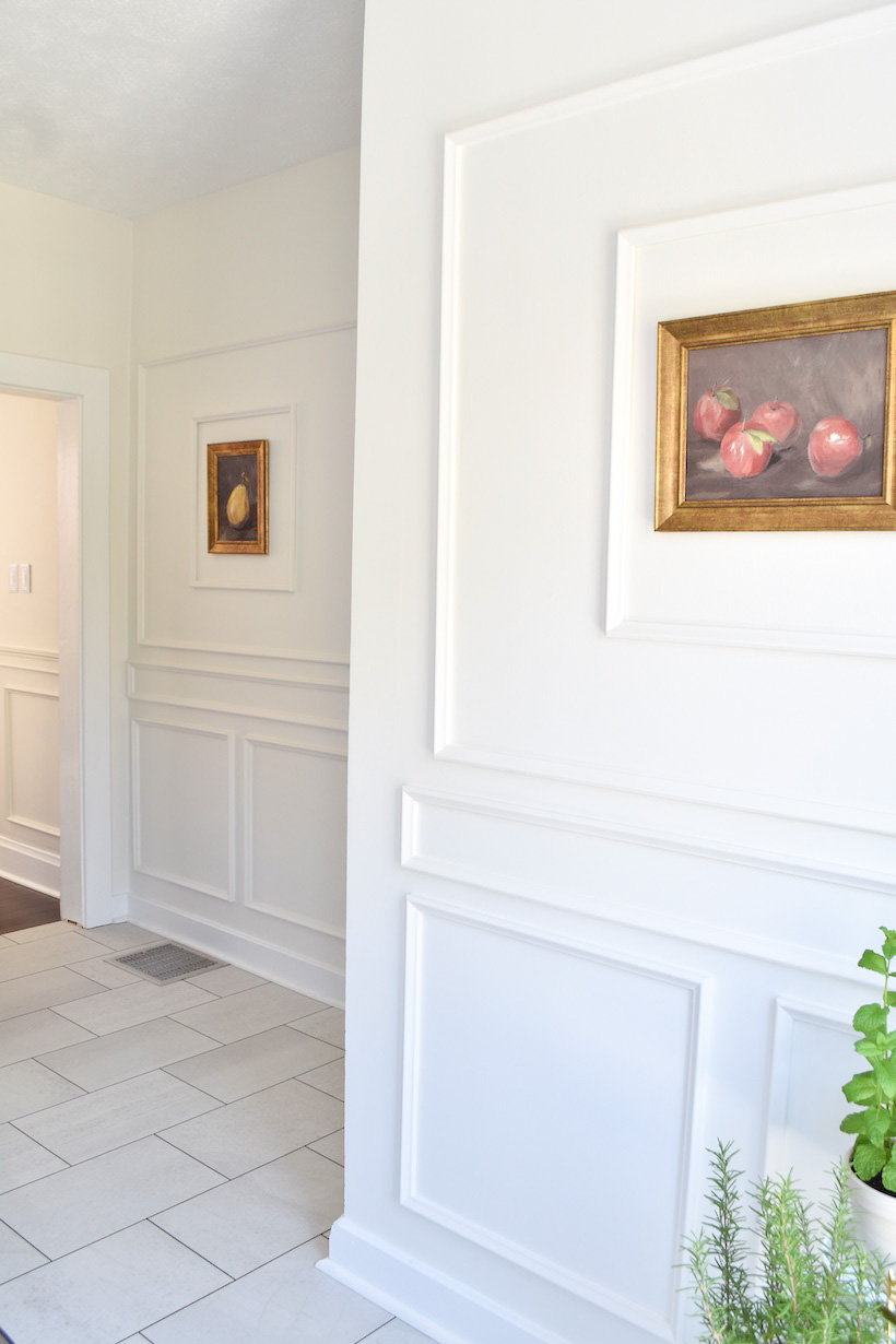
The solution? Enhance the blank walls with wall moulding! I’m so glad we agreed to bring this into the kitchen. Our dining room leads into the kitchen and as you can see the wall moulding flows from one room to the next – creating an intentional and cohesive design element.
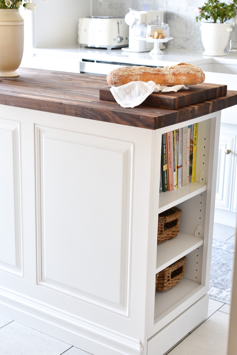
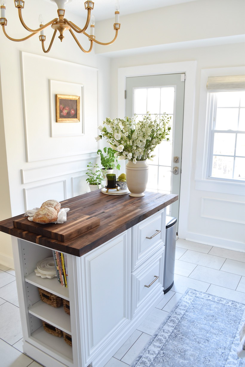
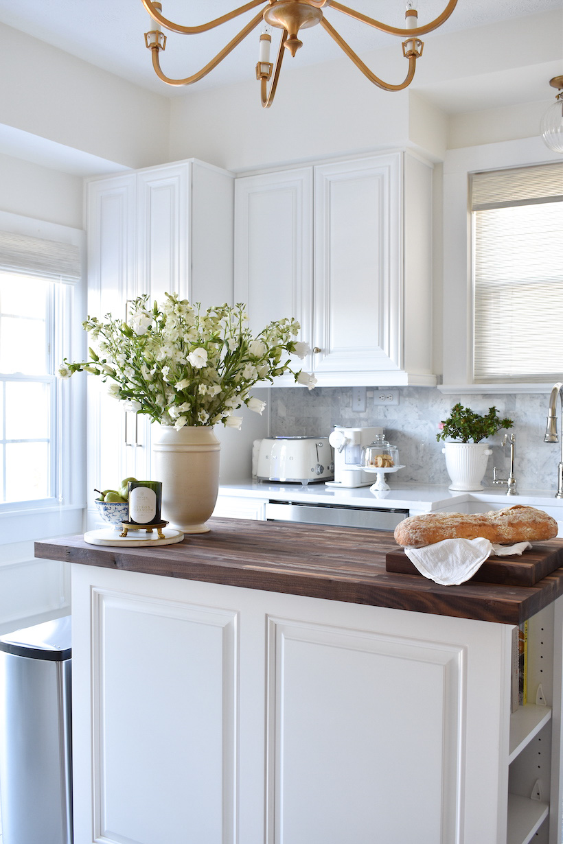
While it would have been nice to have an island that has a dual function of a prep area and seating space, the size of the kitchen is fairly narrow and a big island wasn’t feasible. We were willing to sacrifice not having seating for a separate area, other than the kitchen countertops to prep food for cooking. When it came to choosing which countertop we would use for the prep island, we knew that while it would have looked pretty to carry the same Quartz countertop, we didn’t want to feel like we had to be delicate with surface so the solution for us was having a beautiful Walnut Butcher Block installed. The rich color of the butcher block automatically warms up the space and keeps it from feeling too stark or cold.
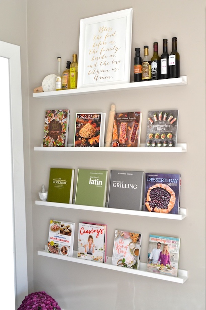
Storage solutions continued to play a big part in this prep island. We had to have shelves for cookbooks and baskets for produce – like onions and potatoes. The shelves are really deep where I can store two rows of cookbooks. Initially, we planned on having a pull out drawer that would house the trash can but that would have taken up a lot of storage space to the right of the base cabinet. It was more about convenience for us, so we opted to have a free-standing trash can that has two containers in one – one for trash and one for recycling. We thought the location of the trash can would bother us but it’s nicely tucked next to the prep island.
The prep island has two large drawers and drawers within those drawers! Perfect for housing kitchen essentials used to prep food like mixing bowls, measuring cups and spoons, colanders, cutting knives, and much more.
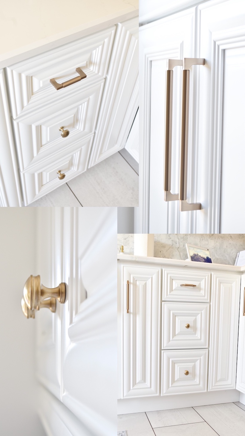
For the cabinet hardware, I went a mix of both pulls and door pulls. For a classic feel, I went with a warm brass finish.
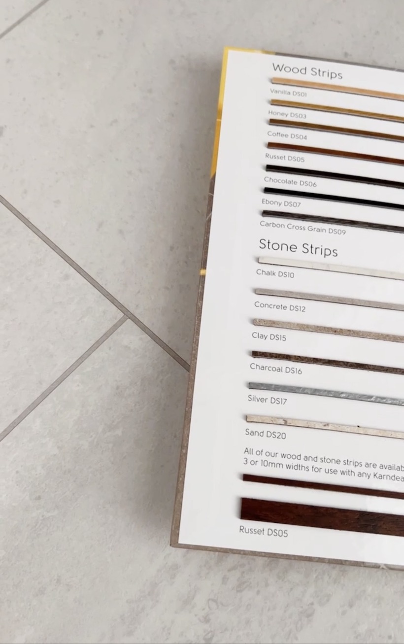
Let’s talk floors…this must have been the hardest part of kitchen renovation. Everywhere we looked, it seemed like wood-look laminate was the only option available. While we love hardwood floors and it would have been nice to have them installed in the kitchen, it would have been nearly impossible to match the existing wood floors that are in the dining and living room – as they were installed many years ago. We preferred to go with a tile anyway. We finally found luxury vinyl tile planks that requires a glue-down install. It is the perfect color – ‘Honed Oyster Slate’. To enhance the look of the tile and bring in some of the dark color from the butcher block and the wood floor from the adjacent dining room, we had wood strips installed in between each plank. The planks were installed in a brick and mortar pattern.
And there you have it, my friends. Our kitchen remodel is complete! We have definitely noticed the difference at how much easier it is to prep food and move around the kitchen. The best part too is how organized everything is with all the storage solutions we had incorporated into the new kitchen design. We are happy with the transformation.
I’m certain I will do a follow-up post to include all the ways I was able to organize the inside of the cabinet drawers – stay tuned for that. If you have any questions or want sourcing information, please leave them in the comments below and I will do my best to answer them.
I hope you enjoyed seeing our remodeled kitchen and it gave you inspiration for creating your own happy space.


Your kitchen is beautiful! Well done.
I’m wondering which manufacturer you used for you kitchen faucets? I’m looking to replace mine and yours are exactly what I would like to purchase.
Thank you.
Thank you Christine! The manufacturer is Signature Hardware – you can find them online. The item description is called ‘Amberley Single Hole Pull Down Kitchen Faucet’. The finish I chose is ‘Polished Nickel’.