Leaves are about to fall and change as bright bold colors paint the landscape of all the trees, the first hint of chill is in the early morning air as summer turns into fall. The weather is still enjoyable to gather and dine alfresco style, so make your outdoor dining table a cozy place to be with nature’s picturesque window as your backdrop.
For today’s inspiration post, I would like to share a few ways on how I transitioned my tablescape from late summer to early fall and how I let nature and some of the elements of the season dictate the items I chose.
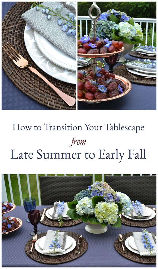
Tablescape details
– Colors
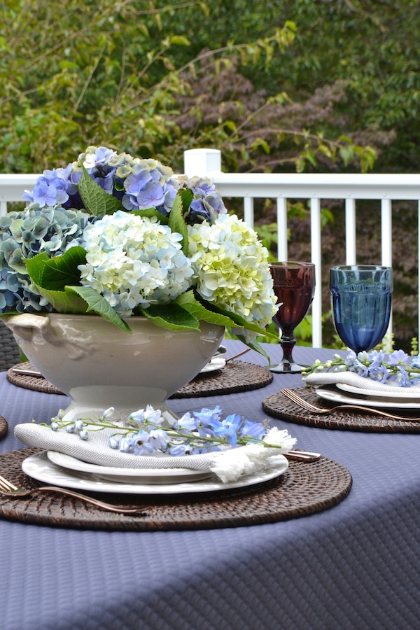
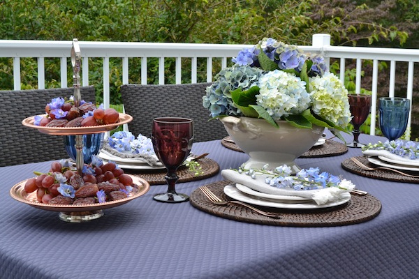
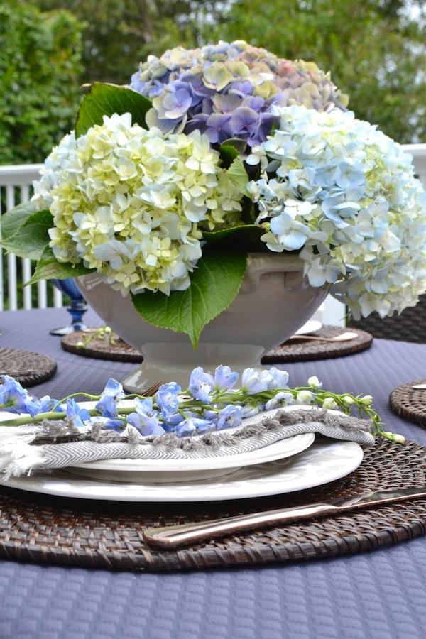
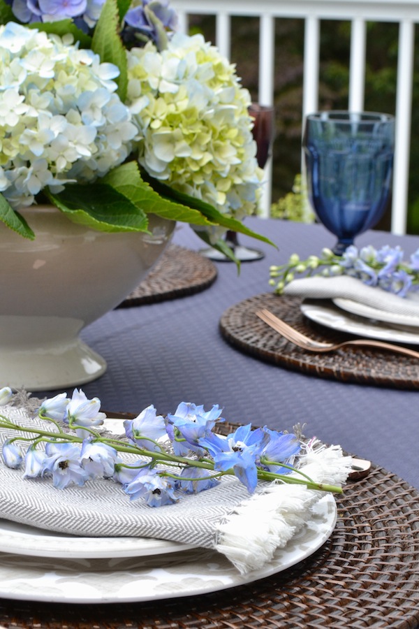
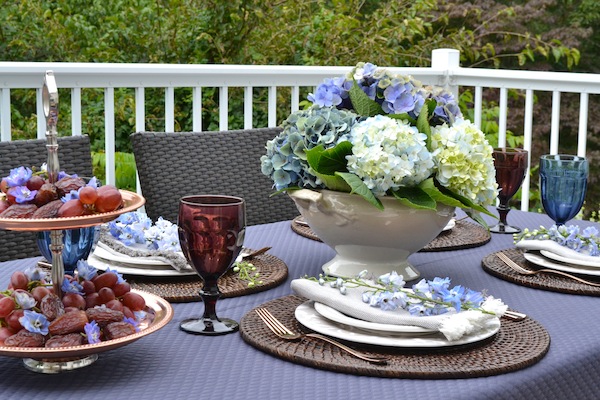
‘Tis the season for warmer tones! Color is key when it comes to pulling a theme together. Pick a palette and choose colors that whispers fall. Blue hues will transition easily into the early days of fall. My hydrangea centerpiece includes a cluster of various colors such as, cream, light and dark blue, and light purple. Flowers makes any type of gathering a special one!
Here, I dressed the table with a quilted fabric that automatically gives off that cozy blanket type of feel and coordinates well with the color palette of the flower arrangement. I paired the blues hues with a plum color.
You want the color scheme to flow throughout your table. Limit yourself to colors in the same tint family. To create a sense of continuity, select one or two colors and then use variations of it.
– Flatware
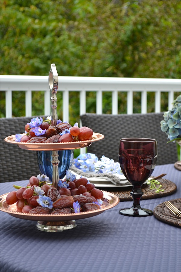
Considering its warm color, the ideal metal for fall is the earthy look of copper. The copper hue resembles a burning fire. To bring more of that copper color, I used my two-tier copper tray and filled it with grapes and dates that purposely have that purple hue.
-Glassware
Rather than using one color drinking glass, I decided to incorporate mismatched color glasses. I used a blue and deep purple color – it added a bit more interest to the table.
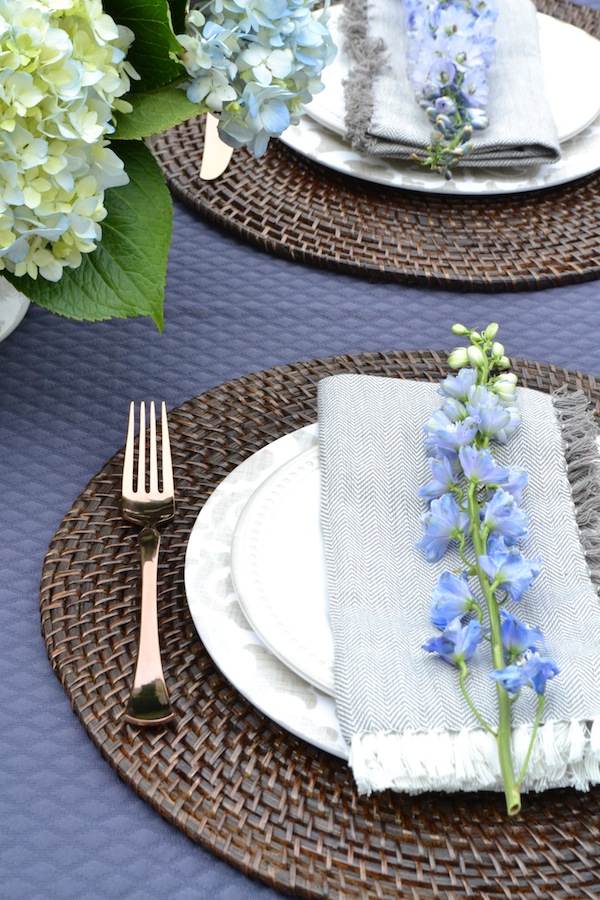
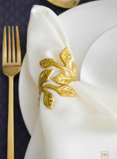
– Dinner Napkins
Dinner napkins are stretched across the salad plate. I love the natural feel and organic look of the cotton dinner napkins. The fringe details of these napkins resemble that of a cozy throw! The pattern design of the napkins coordinate well with the dinner plates and the colors match perfectly. For a decorative touch, the napkins are accented with a stem of Larkspur that are similar in color to the hydrangea centerpiece. A single stem makes a great place card – extra touches make the table extra festive and will guarantee smiles on your guests faces!
– Dinner Plates
Since it is still summer, I wanted limited bold colors because that would have given off more a moody vibe. I went with a neutral beige dinner and salad plates to balance the two bold primary colors. If you noticed – the flower vessel is the same creamy beige color as the dinnerware. A good rule of thumb when choosing colors is two have at least two places with the same color!
– Charger Plates
For a rustic touch, I used dark brown rattan round charger plates. The color resembling that of a tree trunk. The dark brown grounded the cream-colored dinner plates.
Toast the upcoming fall season and move the party to the yard, patio, or deck. Watch the sun go down and relax and enjoy!
-Photos + Tablescape Styling by Rose Angel Lopez


Leave a Reply