One of the things I love to create are color story inspiration boards. With spring on my mind, 2016 Pantone’s color of the year of Rose Quartz and Serenity were two dreamy colors that go so well together! I’ve incorporated each of these colors in two ways – take a look…
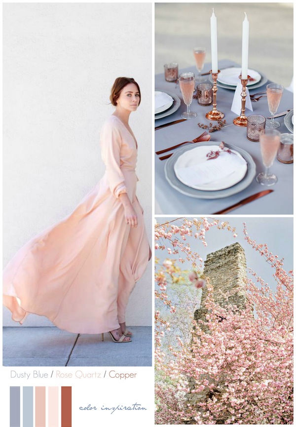
Dusty Blue + Rose Quartz + Copper
The color, ‘Rose Quartz’ embraces rose tones and for this color story, shades of dusty blue mixed with rose quartz and with the jeweled tones of copper – blend beautifully.
*Image Sources: Rose Quartz Linden Silk Wrap Dress via Kamperett // Serenity + Copper Tablescape via Frieda Theres; photographer: Hilal Moses
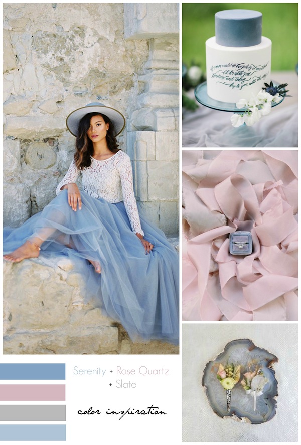
Serenity + Rose Quartz + Slate
The color, ‘Serenity’ is a cooler tranquil blue and for this color story, serenity combined with rose quartz and slate are tranquil colors that feel airy with a subdued brightness.
*Image Sources: Woman in tulle via Green Wedding Shoes; styled by Chloe Delgadillo // Calligraphy cake by Flour and Flourish via Elizabeth Anne Designs; photographer: Heather Nan Photography //Ring via Style Me Pretty; photographer: Milton Photography // boutonnieres on agate via Inside Weddings; photographer: Thisbe Grace Photography



Leave a Reply